Config
Wired doesn't create a config for you. If a config isn't found, Wired will use the default config, which can be found in the root of the repository.
Wired looks for a config file in the following locations:
$XDG_CONFIG_HOME/wired/wired.ron$XDG_CONFIG_HOME/wired.ron$HOME/.config/wired/wired.ron$HOME/wired.ron
Most wired configuration works in terms of blocks. Each notification is comprised of a tree structure of blocks, where each block represents a visual part of the notification.
Each block has 5 properties, all of which are mandatory:
| Property | Description |
|---|---|
name |
A user defined name. |
parent |
The name of the block that should be this block's parent. |
hook |
Represents where this block should be joined to the parent block.parent_anchor: Where to attach on the parent (TL, TM, TR, MR, BR, BM, BL, ML).self_anchor: Where to attach on this block (TL, TM, TR, MR, BR, BM, BL, ML). |
offset |
An x, y offset applied to the block position post-hook. |
params |
Decides which type of block this should be. See (SOMETHING HERE) for block types. |
A basic layout configuration could consist of as little as 3 blocks:
- A
NotificationBlock, the base block for all notifications, which configures properties such as the notification background and its position. - Two
TextBlocks: one for the summary text and one for the body text.
layout_blocks: [
    // Base block -- all layouts must have this.
    (
        name: "root",
        parent: "",
        hook: Hook(parent_hook: TL, self_hook: TL),
        offset: Vec2(x: 7.0, y: 7.0),
        params: NotificationBlock(( ... )),
    ),

    // Summary block.
    (
        name: "summary",
        parent: "root",
        hook: Hook(parent_hook: TL, self_hook: TL),
        offset: Vec2(x: 0.0, y: 0.0),
        params: TextBlock((
            text: "%s",
            ...
        )),
    ),

    // Body block.
    (
        name: "body",
        parent: "summary",
        hook: Hook(parent_hook: MR, self_hook: ML),
        offset: Vec2(x: 0.0, y: 0.0),
        params: TextBlock((
            text: "%b",
            ...
        ))
    ),
]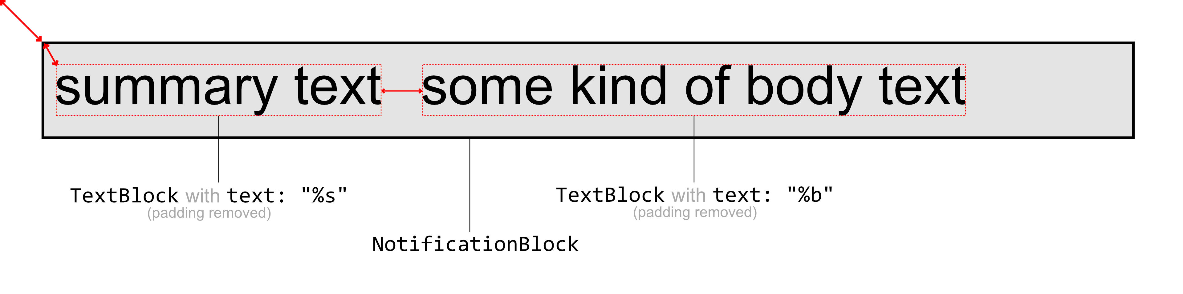
So we have the root NotificationBlock which has a child TextBlock which has a child TextBlock:
-
NotificationBlock(hooked to monitor top left)-
TextBlock (summary)(hooked toNotificationBlocktop left)-
TextBlock (body)(hooked toTextBlockmiddle right)
-
-
We can position blocks pretty intuitively by just hooking things together. This also allows us to have variable sized blocks, and most of the time, we don't even need to mess with offsets -- for spacing, most blocks have a padding setting, which does what it says.
Also note that we can use the self_hook property to change which part of the block gets anchored to the parent_hook. For example, we can use (parent_hook: MR, self_hook: ML) to vertically center this block to the right of the parent.
Let's take a look at a real notification with a more complete config unabridged version here, with the debug option enabled:
layout_blocks: [
    (
        name: "root",
        parent: "",
        hook: Hook(parent_hook: TL, self_hook: TL),
        offset: Vec2(x: 7.0, y: 7.0),
        params: NotificationBlock((
            border_width: 3.0,
            gap: Vec2(x: 0.0, y: 8.0),
            ...
        )),
    ),

    (
        name: "image",
        parent: "root",
        hook: Hook(parent_hook: TL, self_hook: TL),
        offset: Vec2(x: 0.0, y: 0.0),
        params: ImageBlock((
            image_type: App,
            padding: Padding(left: 20.0, right: 20.0, top: 20.0, bottom: 20.0),
            ...
        )),
    ),

    (
        name: "summary",
        parent: "image",
        hook: Hook(parent_hook: TR, self_hook: TL),
        offset: Vec2(x: 0.0, y: 0.0),
        params: TextBlock((
            text: "%s",
            font: "Arial 30",
            color: Color(r: 0.92157, g: 0.858824, b: 0.698039, a: 1.0),
            padding: Padding(left: 20.0, right: 20.0, top: 20.0, bottom: 20.0),
            ...
        )),
    ),

    (
        name: "body",
        parent: "summary",
        hook: Hook(parent_hook: BL, self_hook: TL),
        offset: Vec2(x: 10.0, y: 0.0),
        params: ScrollingTextBlock((
            text: "%b",
            font: "Arial 30",
            color: Color(r: 0.92157, g: 0.858824, b: 0.698039, a: 1.0),
            padding: Padding(left: 20, right: 20.0, top: 20.0, bottom: 20.0),
            ...
        )),
    ),
],
Green borders represent padded layout blocks, and red borders represent unpadded layout blocks.
The structure is as follows:
-
NotificationBlock(hooked to monitor top left)-
ImageBlock(hooked toNotificationBlocktop left)-
TextBlock (summary)(hooked toImageBlocktop right)-
TextBlock (body)(hooked toTextBlock (summary)bottom left)
-
-
-
Having not explained I've added an offset to TextBlock (body) just to show what that might look like.