Transforms 4-D iris dataset into 2-D and outputs plot (requires GNUPlot):
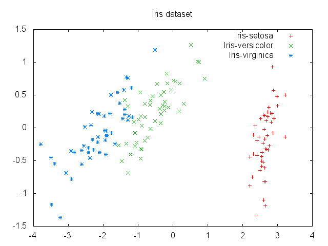
The explained variance ratio shows that most of the variance is explained by the first component:
explained_variance_ratio: [0.9963, 0.0033]
Thus, when we inverse transform the 2-D data back to 4-D, we get a very close approximation:
Inverse reconstruction vs orig (first 10 rows)
[5.1, 3.5, 1.4, 0.2]  [5.1, 3.5, 1.4, 0.2]
[4.8, 3.2, 1.5, 0.2]  [4.9, 3.0, 1.4, 0.2]
[4.7, 3.2, 1.3, 0.2]  [4.7, 3.2, 1.3, 0.2]
[4.6, 3.1, 1.5, 0.2]  [4.6, 3.1, 1.5, 0.2]
[5.1, 3.5, 1.4, 0.2]  [5.0, 3.6, 1.4, 0.2]
[5.5, 3.8, 1.7, 0.3]  [5.4, 3.9, 1.7, 0.4]
[4.8, 3.2, 1.4, 0.2]  [4.6, 3.4, 1.4, 0.3]
[5.0, 3.4, 1.5, 0.2]  [5.0, 3.4, 1.5, 0.2]
[4.4, 2.9, 1.4, 0.2]  [4.4, 2.9, 1.4, 0.2]
[4.8, 3.2, 1.5, 0.2]  [4.9, 3.1, 1.5, 0.1]
Reproducing "Eating in the UK" example shown in Principal Component Analysis Explained Visually, originally from Mark Richardson's class notes on PCA (PDF).
A dataset from 1997 of consumed grams of food by type by UK country (England, Wales, Scotland and Northern Ireland), run through PCA to reduce 17-D to 2-D, with country as the row and food type as the column features, produces:
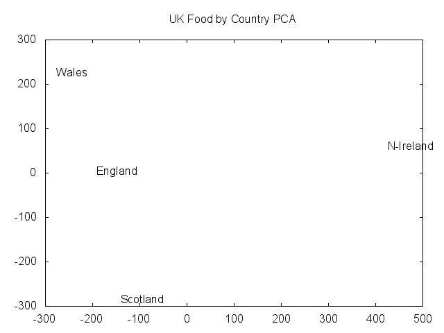
Northern Ireland appears to be an outlier on the first primary component, the x-axis, which explains 84% of the data variance.
Plotting the variance of country data across each food type helps identify where to look in the data for an explanation:
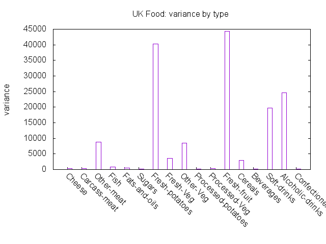
Fresh fruit, fresh potatoes, alcoholic drinks and soft drinks have the highest variances.
Plotting the values for each food type shows how Northern Ireland differs from the other countries:
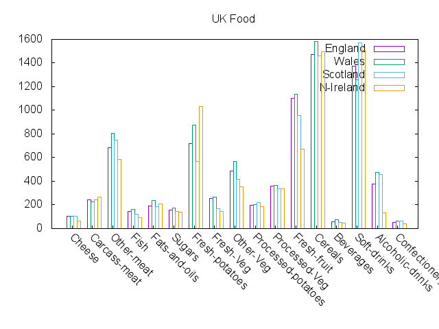
From the plot, you can see that Northern Ireland consumes far more fresh potatoes, and far less fresh fruit and alcoholic drinks.
Sample of original faces before running PCA:

Same sample faces, after PCA transform with 36 components and then inverse transformed:

Prinicpal components visualized (eigenfaces):
